Visual trend report for 2026
Just like a cannon turret, 2025 started by firing bold visuals everywhere. Instagram is THE social platform for revealing art direction, weird video edits, and the mood-creating outlet everyone’s aspiring to reach.
Going towards the end of the year, these signals have evolved into movements. There are now clear paths, which constitute the cemented visual directions for 2026.
After years of aesthetic (2013 to late 2020), much rather cold than based on feeling, design its clearly shifting its emotional center, for quite some time now. This is just a continuation of what’s already happening.
And that’s a breath of fresh air.
People who watch your content have become jaded and are taken aback by all the polish that you try to make by editing your video up to the point of refusal.
They want to see cool visuals, but they also want what’s real. They want the truth. They want to see the behind the scenes, what drives you?
What moves you? What makes you want to get up in the morning and keep doing what you’re doing?
That’s where I’m headed today.
So, how is creativity shifting in 2026?
The Renaissance maximalism
We’re seeing inspiration boards packed with archival fashion, gallery-worthy layouts, luxe metallic touches, editorial-forward typography, and textures that feel handcrafted — marble streaks, brushed metal, paper fibers, pigments that look like they were lifted from a fresco.
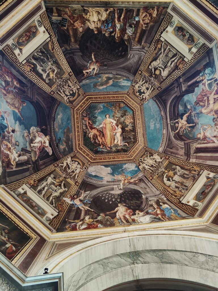
Pop culture, niche internet culture, retro aesthetics, design textbooks, memes, fashion magazines, gaming interfaces — everything is cross-pollinating.
Brands aren’t just referencing other eras; they’re remixing them:
• Y2K concert posters
• 90s hardware advertising
• The Tumblr grunge-gloss era
• Scanned magazine pages
• CD booklet design
• Pinterest-driven moodboard UI
• Fashion editorial spreads
• Comic panel layouts
• Title cards that look like cinematic frames
Audiences crave these layered cues because catching the reference earns you cultural points. When you understand the visual in-joke, you feel like you’re inside the circle.
And smart advertising, or any type of great marketing piece, has always been about making your audience smarter by reading or seeing what you’ve put out.
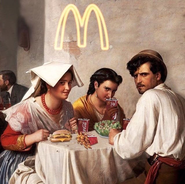
Even classical-art meme culture is still going strong. Renaissance-style image mashups have been thriving since the early 2010s — communities like Classical Art Memes and r/trippinthroughtime built entire formats around them. They endure because human expression hasn’t changed in 500 years; the humor stays relevant.
That’s the new creative economy: familiarity — but with a wink. Clever, not copy-paste.
Complement this chapter with my take on the Renaissance of 2026 in marketing, in my article written on Dreamstime. – delete pana am linkul
The analogue style is cementing its stay
The film grain, the smudged textures, the doodles, the messy handwritten style, the polaroid frames, the scanner dust, the flash washout – all these have become emotional anchors in today’s visual narrative.
Everything that matters has its own story. Its own pace, and the intention behind every piece of content, is way bigger than ever before.
In the mid-20th century (1950s-1990s), when consumer film photography was widespread, but each roll of film had only 24 or 36 exposures, there were limits to what you considered worthy of capturing. You needed to know what you were trying to capture and to think about it before immortalizing it.
This deliberate, thoughtful approach to photography largely ended with the rise of digital cameras in the late 1990s-2000s and was completely transformed by smartphone cameras in the late 2000s-2010s, which made photography essentially limitless and instantaneous.
So now, we’re witnessing a comeback. Nostalgia has been the visual backbone for some time now. We saw it in so many campaigns and pieces of content that no matter their shape, it brought in the daylight something that people missed.
The analogue style feels more like a continuation of this nostalgia and of the intentionality when creating a piece of content.
Visual play with layers: Meta cinematics
It’s the tension between what we know is fake and what looks real.
The scene where someone pours something into someone else’s post has circulated all over the gram. And it was a super creative idea. This style continues to flourish, and we’ll be seeing a lot of it in 2026.
Instead of treating the frame as a flat box, creators are stacking realities: the real world, the digital interface, and the imagined space in between.
You might see a product spilling out of an Instagram comment section, or a hand reaching through a fake notification. The goal isn’t realism — it’s illusion. It creates the feeling that the digital world has become self-aware and is interacting back.
The digital world has become self-aware and it’s interacting back.
This layered approach works because people instantly recognize UI shapes and platform cues. A like button, a text bubble, a screenshot frame — these are now part of visual language.
When you mix them with physical objects, the brain gets a tiny jolt of surprise. It’s the same instinct that makes us enjoy optical illusions: the tension between what we know is fake and what looks real.
Meta cinematics play in that space, giving creators a way to make “still images” feel alive without any actual motion.
Brands love it because it’s inherently scroll-stopping.
The viewer pauses for an extra second just to figure out how the image works. That moment of curiosity is gold in a crowded feed.
And because the edits are often playful, it naturally leans into meme culture and remix culture — two things younger audiences adore. Meta cinematics isn’t about showing a product; it’s about showing a world where the product can break the rules of the platform itself. It turns design into a small, self-contained story.
Frutiger Aero
You probably hear about it before, but if you haven’t, just by searching this term or glossy y2k wallpaper, you’ll see what I mean.
This is another element of the nostalgia phase, from the mid-2000s to the early 2010s.
The blades of grass on tech products, glossy plastic textures, and water are all main elements of Frutiger Aero.
This style was announced at mid-2025 as well, by art directors and creators who educated they communities on digital marketing.
What is noticeable from afar is that these old-school styles are rebelling against the futurism of AI.
Whenever things are pacing too much, I’d say it’s human nature to pause, and take a moment (or more like a few years) to look back on what was.
And that’s beautiful, really.
Anyhow, my explanation for these old-ish styles is more of a philosophical one:
We have all the time in the world to focus on futuristic tech. It will only get more futuristic by the day. But more often than not, the future is cold. The future doesn’t exist (because we’re always in a constant past and present), and it is effing cold. We have no memories of the future, as it hasn’t happened yet — so how can we make it a style dear to us?
It needs to contain other elements for us to cling to it — to use it enough that it eventually becomes a visual movement.
It would have to have a unique voice that says something so important and so vital that it stops us in our tracks, and makes us consider “futuristic tech” as the next visual direction.
But until then, we’re going to be talking more about nostalgia.
Skeuomorphism
Visualize your phone icons. They’re almost 3D, right?
Skeumorphism is a design style that makes digital interfaces imitate real world objects, in a way that they look touchable, and almost real. Like buttons.
Again, for a decade, digital design worked to become invisible, minimal, noise-free, neutral. Skeuomorphism was abandoned since iOS 7.
But now, it’s coming back, but not in the same “leather-stitched calendar app” way we left it in 2013.
So in 2026, the predictions say that instead of recreating real-world objects perfectly, designers are borrowing just enough physical cues to make digital elements feel tactile again.
Soft shadows. Highlighted edges. Squishy buttons. Glassy surfaces. Interfaces that look pressable rather than flat. It’s more about vibe than imitation.
We’re in a post-flat-design world where minimalism became generic and sterile. Gen Z loves character, texture, and play. We’re seeing 3D flourishing not only in UI icons, but in product photography, brand visuals, and digital fashion — blending physicality into everything.
Minimalism
Even though I’m taking this in a direction where minimalism no longer lives, it does. And it’s kind of evergreen.
Just that now, minimalism is even more intentional. Instead of showing neutral tones where everything blends in, we’re now seeing a plain background and a big, bold font. Often, one word, or a quote, an intro for a movie, or for a short video.
It’s often one detail that carries the whole story. A single headline, on a muted background.
This doesn’t mean we’re relying solely on black, white, beige, and grey tones. We also see a colorful minimalism; a two-color editorial can make a campaign successful (with the right message, also, of course).
The blueprint or the thinking-out-loud style
I’m sure you’ve seen those recipes with doodles, messy handwrite and scribbled arrows, that tell the ingredients and the making process. Or breaking down an outfit, describing something like a tutorial, educating your community about any topic, describing a workout session, or what’s in your bag.
No matter what it is, we’ve seen this design anywhere.
And there’s the more technical blueprint style:
Typography as an identity
Sharp, stretched, oversized, layered, and constantly in motion — type isn’t just delivering a message anymore, it is the message.
Letters are acting like characters in the story: dramatic, energized, and loud enough to stop thumbs mid-scroll.
We’re entering a moment where a brand can flash one animated headline, and you immediately feel who they are — before you even process the words.
Are they playful? Is the font big, mushy, and Pixar-like? Are they bold, with square edges? Or are they romantically creative with one letter from one family font, and the rest of the word from another family font?
Fonts speak louder than ever, so pick your few fonts and use them intentionally throughout your content.
Mixed dimensions, 3D & cinematic surrealism
Design is drifting into alternate-reality territory. This is where we can clearly see the influence of AI.
We’re seeing real photography collaged with shiny 3D objects, warped shadows, impossible lighting, and scenes that look like they were filmed in a dream logic universe.
Apps like Pika are creating outrageous 2-3 second videos, based just on one photo. For example, you coming out of a printing machine, you as a 3D character, being held by strings like a puppet, you coming out of a shoe, or surreal stuff like that.
Those “cut-and-paste 3D” social layouts — floating emojis, bending screens, playful depth — are everywhere for a reason: they give static content the illusion of spatial movement.
And we have seen them e v e r y w h e r e — at any content creator that takes a bit of effort into putting trending concepts out there.
Even without interactivity, visuals are talking in AR/VR language now. Layers imply worlds that extend beyond the rectangle of your phone.
The intention is clear: Content shouldn’t just be visible — it should feel explorable.
And this cinematic direction leads us to a neat path to movie-making. Remember the BMW films made by the Fallon Agency, which startled the advertising industry and opened a new creativity gate?
We’ll soon see more pov narratives in campaigns, more storytelling — all made with surreal elements that speak louder than ever, that we’re witnessing a new era for content, advertising, and creativity.
I’ll end this chapter with a few words from Jeff Goodby, as mentioned in The Idea Writers by Tereza Iezzi, which was written years ago, but still points out perfectly the sweet spot for marketing right now.
“In a way, I feel like the work isn’t about a campaign now. We put out something that is like a novel without words. But the plot of it and the complexity of it are like Balzac or something. You invent characters, they have lives, they think stuff, they do things. I’m much more likely to need somebody to create a car website that is about space, as in — I want you to think about space as an abstraction, and what does it mean to people to have space and be able to move in space. And so the kind of brief we give out is much wackier than we used to give out.”
The new eco aesthetic – not just an aesthetic
I’ve noticed greens and browns evolve into something more polished: sage and clay against stone textures, muted florals, earthy gradients, and linen-like surfaces.
It whispers sustainability, you just look at it and instantly understand: This brand chooses care over chaos.
This aesthetic also comes with some directions taken by certain brands into sustainability. So instead of being just a curated feed, the 2026 eco aesthetic wants to also see some actions that keep the brand’s voice real, and have an impact in the real world.
Editorial precision returns
It’s not just raw, unedited, and behind the scenes. We’re also seeing an editorial approach, the kind of feed your lose yourself in scrolling like in a rabbit hole. Every photo is more and more peculiar and inspiring.
Social feeds are taking cues from glossy print again. I’m talking structured layouts and confident serif headlines.
White space is treated like a luxury item.
Everything aligned, refined, and intentional — like a fashion magazine spread.
And yes — it’s the human duality that makes perfect sense. In the same world that’s obsessed with messier, human content, we also crave order and curation.
Cyber pastels
Pastels aren’t acting shy anymore — they’re glowing. Think chrome-sheen gradients, neon-blushed edges, surfaces that look pearl-laminated or digitally lit from beneath.
This palette pulls from vapor-futurism and Frutiger Aero, but with an upgrade: technology meets candy-color dreamscape.
It’s the soft rebellion of the screen generation.
The four core directions of 2026
Different aesthetics, same north star. Visual culture is moving toward:
• Texture everywhere — imperfect, tactile, touch-coded
• Digital that pretends to be physical — depth, shadow, and tangible surfaces
• Design that reveals the process — blueprints, drafts, raw layers
• Visuals that feel immersive — tiny worlds built inside a single frame
We’re no longer pretending our creative tools are human-only.
AI is now part of the workflow — and transparency is becoming the rule.
If a piece is AI-assisted, disclosure matters.
So keep it real, intentional, meaningful, and don’t postpone what you have in mind — creativity is more alive than ever.
Some images are embedded from Pinterest. Copyright belongs to the respective owners.